
A bakery website that runs itself.
Chaos Crumble is a licensed home bakery in Colorado Springs, and she doesn’t have time to also be a webmaster. So I built her a site where the seasonal menu, the events calendar, and the order rules take care of themselves.
The live site today. It didn’t start out looking like this, and that story is further down the page.
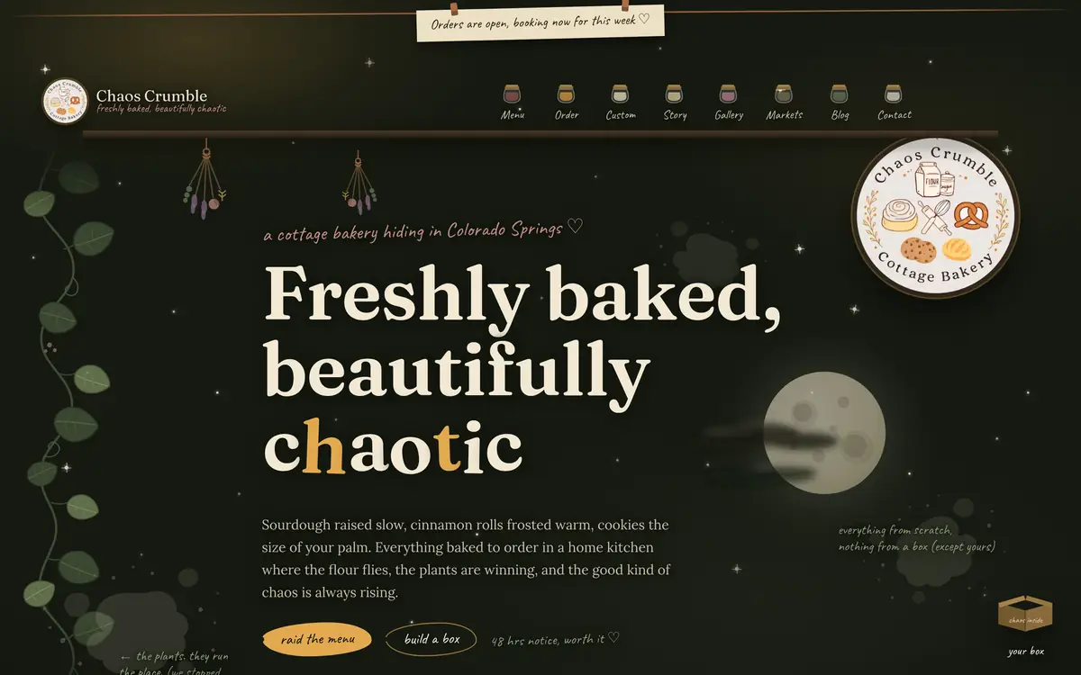
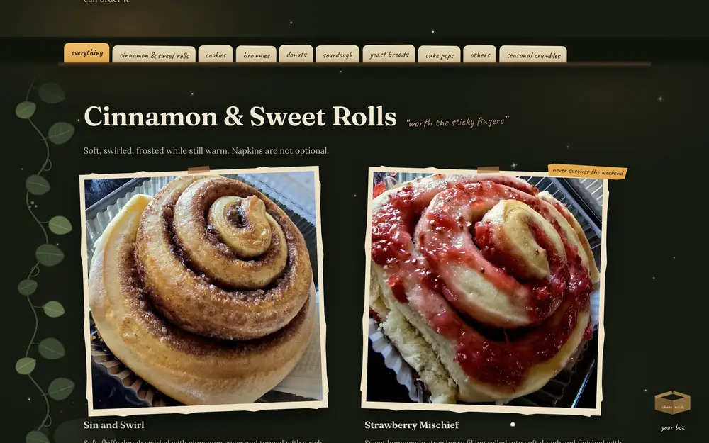
A quick look at how the first version felt in the browser, next to a few real bakes from her gallery. No filters, no stock photography.
What she actually needed
Before this, everything ran through Facebook. Orders came in as messages, texts, and the occasional JotForm link, and her menu lived wherever she had last posted it. She didn’t need a brochure. She needed infrastructure:
- A menu customers could actually order from, with her real pricing: singles, bundle packs, per-flavor boxes
- A calendar of markets and events that stays current without her updating it by hand
- Something she could edit herself, with no code, ever
- Legal footing for a Colorado cottage food operation
- Complete ownership, no dependency on me after handoff
Every hour this site costs her to maintain is an hour she isn’t baking. That’s the constraint that shaped almost every decision after this.
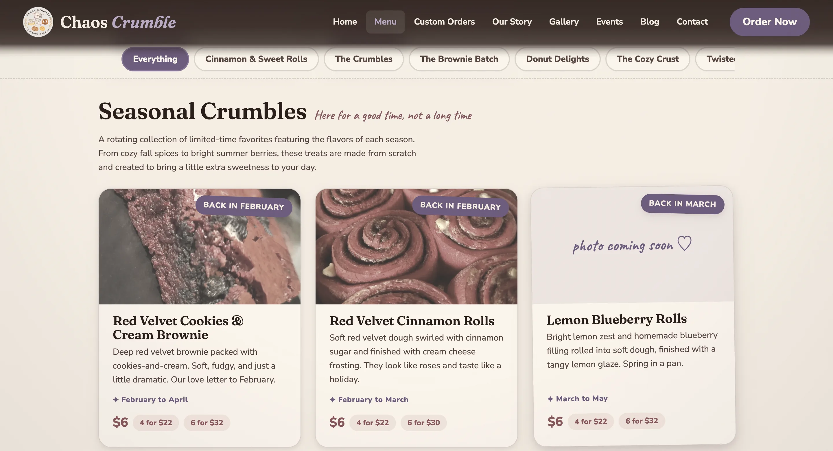
The seasonal menu that takes itself down
Every bakery wants pumpkin in October. Almost nobody remembers to take it down on November 30th, so it lingers, someone orders it in January, and she spends her morning writing an apology instead of baking.
I didn’t want to build her a site that depends on her remembering things. So seasonal items are told which months they belong to, once, and then they handle themselves.
The call I’d defend hardest: out-of-season items stay visible instead of disappearing. A customer who scrolls past the red velvet cookies in August and thinks that looks incredible isn’t a lost sale. She’s someone who now knows to come back in February.
Seasonal menus don’t fail when you put the item up. They fail when you forget to take it down.
It works one layer deeper too. S’mores was the tricky one: the cookie itself isn’t seasonal, only that flavor was, so it quietly dropped off the flavor list in November and came back in July. The cart just wouldn’t offer it out of season, which means nobody built a box of twelve, paid for four S’mores, and found out afterward. (It has since been promoted to year-round, a decision that was hers to make and took exactly one checkbox.)
Pricing that matches how she actually sells
Her price list isn’t really a list of products. It’s a list of ways to buy them: $5 each, 6 for $20, or 12 for $35, and for the boxes, a mix of flavors she lets the customer put together.
So the order flow follows that same shape instead of flattening it out. Pick a box size, then build it flavor by flavor with a counter that counts down to “perfect ♡.” You can’t submit a box that doesn’t add up, so she never gets an order she can’t fill.
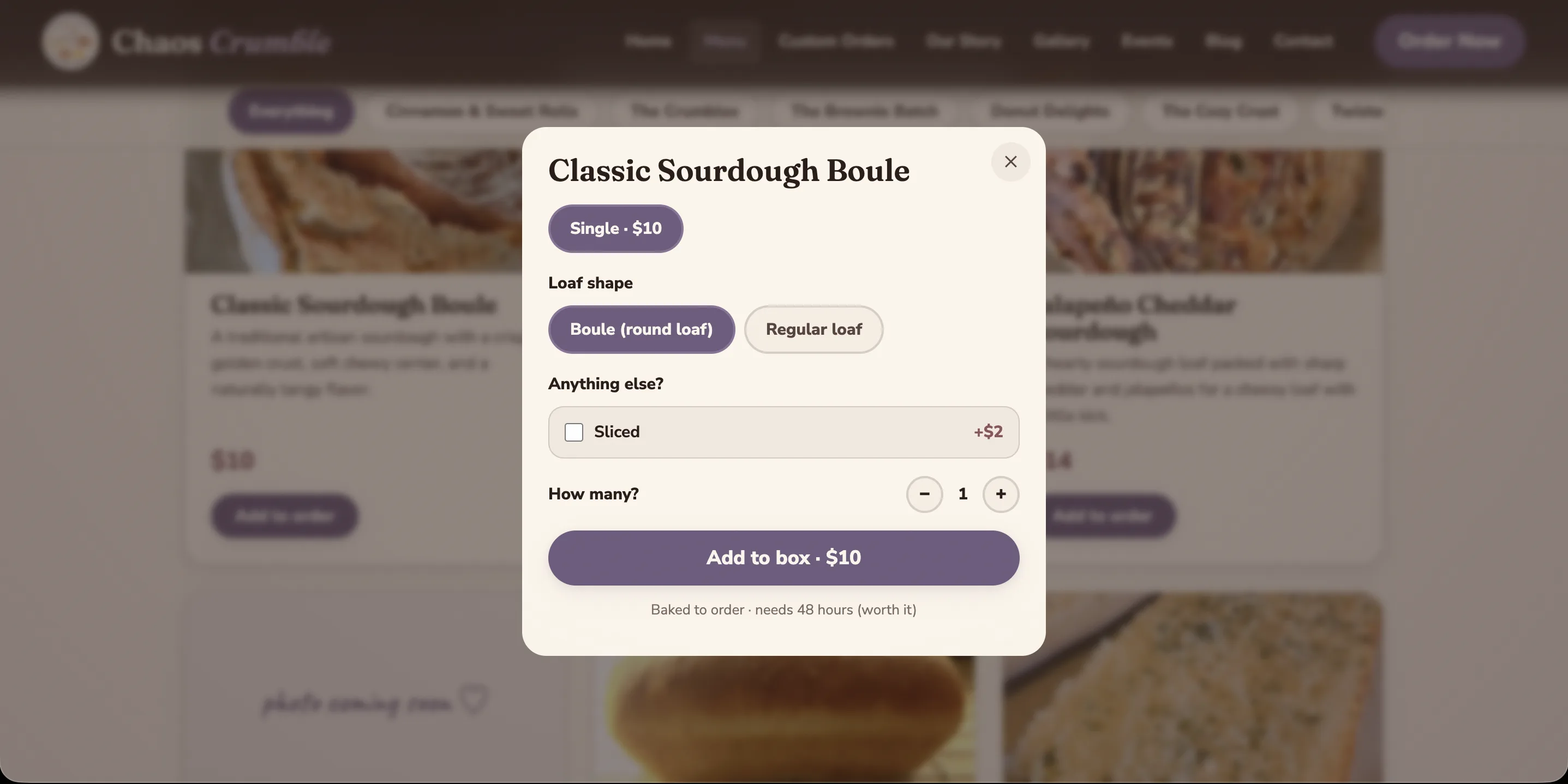
Two option types sit on top of that: free choices, like boule versus regular loaf, and paid add-ons, like sliced for two dollars more. Both land in her order notification automatically.
My favorite bit of logic in here’s a question that knows when not to even ask. Her pączki come in six fillings, and customers usually pick powdered sugar or vanilla glaze on top, except two flavors that already come finished, so the question just skips those.
Nobody will notice this. That’s kind of the point.
Lead times the site enforces on her behalf
Sourdough needs 48 hours, and that isn’t a policy I made up. That’s fermentation. It doesn’t care how nicely you ask.
So every product carries its own lead time, and checkout reads the whole cart and enforces whichever one is longest. Add a sourdough boule to a box of cookies, and same-day pickup just isn’t offered anymore.
She never has to be the one who says no.
A CMS her mother could use
The brief was “easily editable for people who don’t know a single thing about code.” I took that literally. There are 122 fields across 9 sections, and not one is labeled in developer language:
- “Available right now?” A toggle. The hint under it just says: turn this off when a treat is resting for the season, everything is saved, flip it back on whenever you’re ready.
- “Only sold certain months?” A checklist of month names.
- “How much notice do you need? (hours)” A plain number field.
- “Allow same-day rush orders?” Turn it off for anything that physically needs the full time, like sourdough.
Writing the actual words for a CMS is unglamorous work, and it’s most of what makes a handoff succeed. A field she doesn’t understand is a field she won’t touch. A field she won’t touch is a website that slowly goes stale.
What shipped, technically
Measured from the first production build. Nothing here’s rounded up.
- 1.17 MBFull menu page (33 products, all photography), down from 17 MB in her original files.
- 23Total network requests on that page.
- 0Runtime JavaScript dependencies. No framework, no jQuery, no tracking bundle.
- 31 KBAll site JavaScript, hand-written: cart, checkout, filtering, and the signature animation combined.
- 16 MB → 4.1 MBPhoto library, re-encoded to WebP with no visible quality loss.
- 122Plain-language CMS fields across 9 sections.
- 16Pages, every one statically rendered and fully crawlable.
- WCAG AAContrast verified across the palette with a custom audit script.
Her original photos came straight from a phone, and the menu page weighed 17 MB. On the mobile connection most of her customers are on, that page basically never finished loading. Getting it down to 1.17 MB (about a 93% cut) with no visible quality loss was the least glamorous work in the whole project, and probably the most valuable.
Then she saw it all together, and it wasn’t her
Everything above worked. The seasonal engine, the box math, the lead times, the CMS: all of it did exactly what it promised. Then she looked at the whole thing assembled and told me the truth, which was that it still didn’t feel like her.
She wasn’t asking for a revision. She had no notes, no list of fixes, nothing to mark up. She just knew it wasn’t hers. So I asked her the only question that was going to get us anywhere: what do you want it to feel like?
That question is the whole job, and it’s the part nobody puts on an invoice. A client can’t tell you what to build, but she can absolutely tell you what it should feel like standing in it, and that turns out to be the more useful answer. Hers came back in eight words, and the entire rebrand came out of them.
It needs to feel like her.Her whole diagnosis, in five words. Everything after this is me answering it.
Eight words in, and a whole different bakery out
I didn’t ask her for reference sites or a color palette, because she would have picked something that looked like everyone else. I asked how she wanted it to feel, and she answered in eight words. Every one of them turned into something you can point at on the live site.
- 01
Dark cottagecore
A forest-dark ground with flour-cream text, and honey held back for the things you can actually press. Not a black theme. A kitchen at night.
On the live site - 02
Moody
A real sky. A moon with craters and a glow, soft clouds drifting back and forth in front of it, and stars scattered across the whole page rather than piled in one corner.
On the live site - 03
Witchy
The names. Witching Hour, Midnight Crumble, Dark Magic, Spice and Vice. Never costume witchy, because her bakery is called Chaos Crumble, not Witch Bakery.
On the live site - 04
Earthy
Moss, dried rose, and rust for anything decorative, and self-hosted type with real ink weight to it, down to the handwriting on the order slip.
On the live site - 05
Whimsical
A rolling pin that tumbles down the screen when you least expect it and lands in a puff of flour. Flour spatter on every page. No cart, because carts are for grocery stores, just a kraft box you toss things into.
On the live site - 06
Botanical, dried floral
A pothos vine growing down the margin, drawn as a repeating tile so its leaves stay attached at any screen width instead of getting sliced off at the edges.
On the live site - 07
Overgrown garden
That vine isn't an accent. It runs the full height of the page, and her own tagline admits the plants are winning.
On the live site - 08
Mysterious, almost, but cozy and inviting
The reason it never tips into gloomy. Warm light on everything interactive, handwritten notes in the margins, and every single text pairing measured at 6:1 contrast or better. Moody is a palette, not an excuse.
On the live site
That list is the entire second brief. No mood board, no revision cycle, no committee. She couldn’t have written it at the start, because you can’t name a feeling you haven’t seen missing yet. It took a finished site that wasn’t quite her to show her what she actually wanted, and once she could say it out loud, it was specific enough to build from directly.
Before: anybody’s bakery. After: hers.
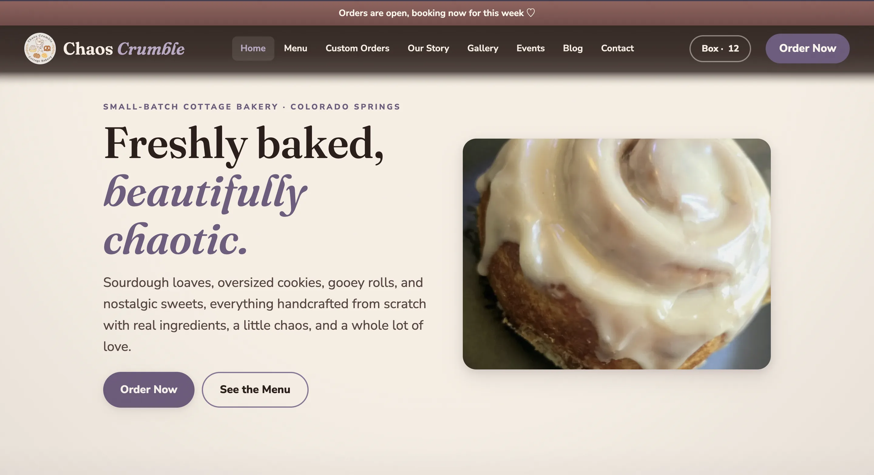
Same bakery, same products, same person. The first one is competent and it could belong to anybody. The second could only be hers. Nothing about the second version is louder or busier, it just stopped describing a category and started describing her, and all of it still sits perfectly still for anyone who prefers reduced motion.
The menu is a recipe box. The cart is a kraft box.
The menu filters became card-stock divider tabs on a wooden shelf, one tap each, and every filter is deep-linkable, so she can text a customer a link straight to the brownies.
And there’s no cart anymore. Her order page says it best: no carts here, carts are for grocery stores. Things you toss in tumble into a kraft box with a puff of flour, and a handwritten order slip does the bundle math live, crossing out what you just saved.
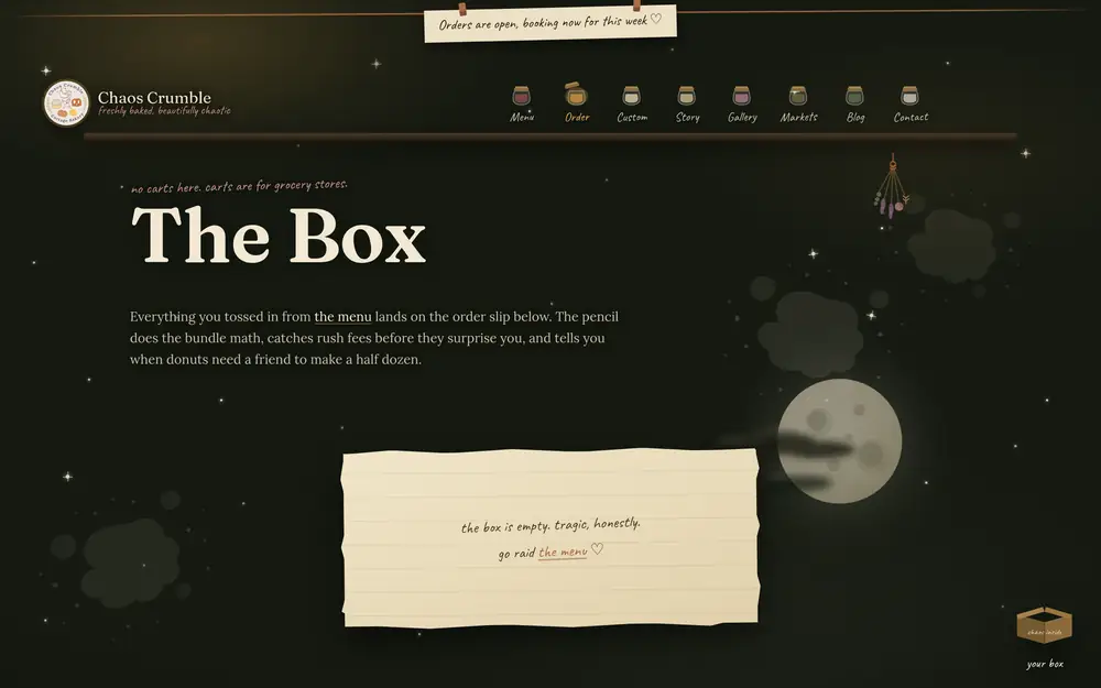
Left: the live menu, mid-scroll. Right: the order slip before you have raided anything. It has opinions about that.
She set the tone. I wrote to it.
The rebrand went deeper than color, and this part started with her too. She had already named her own menu sections: the brownies are “don’t share these,” the sweet rolls are “worth the sticky fingers,” the donuts are the forbidden breakfast. That one line of hers set the register for everything. Deadpan, confessional, a little guilty. So I wrote every product name against it. Sin and Swirl. Strawberry Mischief. Witching Hour. Midnight Crumble. Peanut Butter and Chaos. The Cozy Bandit.
She came back with a handful of her own, we swapped those in, and that was the end of it. One pass, because the tone was never in question. When you build to someone’s actual voice instead of guessing at it, you don’t need five rounds to land it.
Every name lives in a plain CMS field next to a description that still says what the thing actually is. If she ever wants a rename gone, she edits one field and it is gone. She doesn’t need me for that, and she never will. The chaos is hers, not mine.
The seasonal engine from Problem 01 learned a new trick along the way: launch dates. A cookie can go up on the live menu before the recipe is finished, grayed out and priced, with the month it arrives written on the card and a photo frame that admits the samples keep getting eaten. Witching Hour, her brown butter espresso cookie, went up that way. The day its date arrives it starts selling itself, and nobody redeploys anything, least of all her.
Checkout that protects a one-woman kitchen
The launched site takes real card payments through her own payment account, straight to her own bank. But it deliberately doesn’t grab the money the moment someone checks out. The card is authorized, and the charge only completes when she confirms she can actually bake it. A busy weekend can’t oversell her, because she is the last word on every order, with one tap.
Under the hood, the server does its own math. Every order is re-priced from the site’s own copy of the menu, so a tampered cart simply bounces. And if a card fails, the order still arrives by email, so a payment hiccup never costs her the sale.
One more honest note, because that’s the deal on this page: live testing revealed her payment provider’s own dashboard couldn’t complete the confirm step. So I built her a private page instead. It isn’t in the sitemap, it isn’t linked anywhere, and it lists each pending order with two buttons: take the money, or let it go. Her in-person market sales never touch it. Problems found in production got fixed in production, and then they got written down here.
Features that wait for her, not the other way around
A bakery’s second year won’t look like its first, so the site already contains the features she will grow into, each one built, tested against real payments, and sitting behind a switch in her CMS:
- Market-day pickup: when she’s selling at an event, customers can collect their order there, with no delivery fee
- The Chaos Box: a surprise assortment she can list whenever she has a baker’s-choice kind of week
- The Weekly Ritual: a prepaid four-week club, with every choice editable from the CMS
- Monthly caps on any product, so a small-batch item can say “only a few a month ♡” and the site enforces it for her
She flips them on when she’s ready and off when life is loud, herself, for free. Growing the business should never require buying a new website.
Still nothing rounded up
Measured against the live site at chaoscrumblebakery.com, not a local build.
- 30Products on the live menu, every one renamed in her own voice, every rename hers to veto from the CMS.
- 30 KBHand-written JavaScript running the menu, the box, and the live order slip. Still no framework, no jQuery, no tracking bundle.
- $0What the stack costs her per month. Hosting, CMS, forms, analytics, and email routing all run on free plans in her name. The only fees she ever pays are the card processor's cut of a real order.
- 386Automated checks that run against the build: pricing math, seasonal logic, the box flow, three screen sizes. Zero failures at launch.
- 6:1+Measured contrast on every text pairing. The site went dark, moody, and witchy, and it still clears the accessibility standard with room to spare.
Before launch, every checkout guard was tested against the deployed site: tampered carts, impossible quantities, bogus discount codes, empty boxes. The full sweep found two real bugs, a rush fee that wrongly applied to market pickups and a form that forgot what you had typed when a discount code went in. Both were fixed, both got their own regression tests, and both are in this paragraph, because documented honestly has to include the bugs.
What she walks away with
Rootline builds sites clients own outright. For this one, now that it’s live, that means:
- The code lives in a repository under the bakery’s own account. I’m a collaborator she can remove.
- Hosting runs on her own Cloudflare account
- The domain is registered to her, on her own registrar account, purchased by her
- Payments run through her own processor, in her name, straight to her bank
- The CMS signs in through her account, from her phone if she wants
- Her business email routes to her own inbox
If she never speaks to me again, nothing breaks. That’s the standard I hold myself to.
She also gets a full screen-recorded walkthrough: every account, every CMS field, everything she can do on her own site, so she has something to come back to any time she’s stuck, without depending on me being reachable on some random Tuesday.
Real ownership means you never have to ask my permission.
Built inside Colorado’s cottage food rules
Colorado’s Cottage Foods Act shapes what this business can legally do, so it shaped the site too:
- No shipping. Sales have to be direct to the customer, so the order flow is pickup and local delivery only.
- Shelf-stable only. We checked the whole menu against this rule together.
- Required disclosures, home-kitchen production and allergens, live where customers actually see them, not buried in a footer.
A 2027 registration requirement is coming for Colorado cottage operations. It’s already flagged in her handoff docs so it won’t blindside her later.
What she says
They took my very “this is what I’m picturing in my head” ideas and somehow turned them into something that actually feels like Chaos Crumble. It feels like my business, not just a generic bakery website.Chaos Crumble’s owner, in her Google review
Having someone who understands small businesses and actually cares about the person behind the business made the whole process so much easier.Chaos Crumble’s owner, in her Google review
The measure of this project isn’t how it looked on launch day.
It’s whether it still looks right next March, when the pumpkin is gone, the red velvet is back, and nobody had to lift a finger about it.
Built with love by Rootline Web Co.